A selection of concept and client work.
Each project approached the same way: understand the business first, design second.
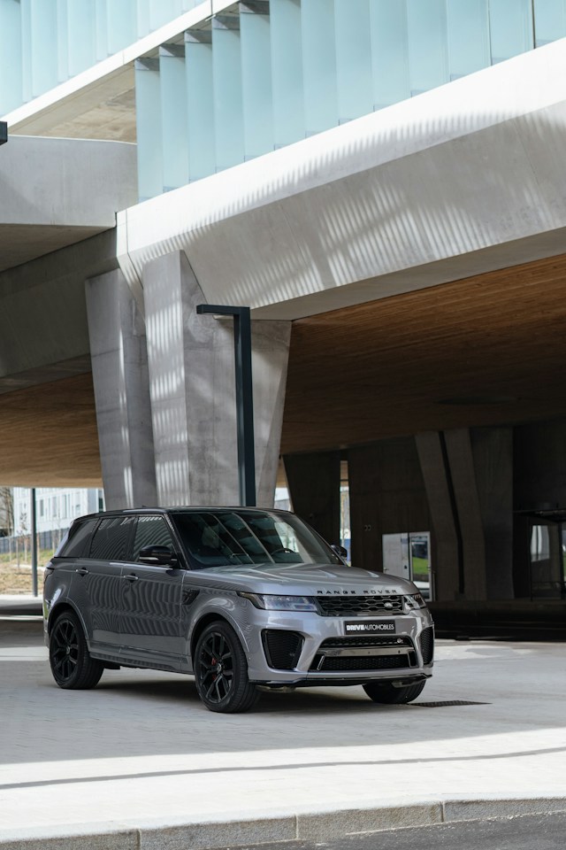 Automotive
Range Rover Evoque
The Challenge
Automotive brands often default to generic template layouts that undersell a vehicle's identity. The Evoque needed a digital presence as confident and distinct as the car itself.
The Approach
Built a dark, crimson-accented interface that mirrors the vehicle's aggressive-luxury positioning — full-bleed gallery imagery, minimal chrome, motion used sparingly to keep focus on the product.
The Outcome
A cohesive, brand-true digital experience with a gallery and features architecture ready to extend across additional vehicle lines.
 Hospitality
Private Transport App
Explore the Client Experience · Explore the Owner’s Command Center
The Challenge
High-end transportation clients expect an app experience as seamless and understated as the service itself — no friction, no visual noise.
The Approach
Designed a clean, auto-layout-driven Figma system prioritizing one-handed booking flows and restrained visual hierarchy, so the interface disappears and the service takes center stage.
The Outcome
A scalable component system ready to hand off for development, built to feel effortless across booking, tracking, and account flows.
 Healthcare
CareBook
Explore the Patient Experience
Designed as a mobile app — best viewed on your phone.
The Challenge
The existing booking flow buried key actions behind unnecessary steps, causing drop-off before patients could confirm an appointment.
The Approach
Mapped the full before/after user flow, cutting steps and clarifying decision points, then redesigned the interface around a simplified path to confirmation.
The Outcome
A measurably shorter booking flow with clearer decision points at every step — a case study in systems thinking as much as visual design.
 Real Estate
Estate Listings Platform
The Challenge
Luxury real estate listings are frequently over-designed with clutter that competes with the properties themselves, undermining the sense of exclusivity buyers expect.
The Approach
Designed a minimal listings interface — large-format photography, restrained typography, and a quiet inquiry flow — letting each property carry its own presence without competing UI elements.
The Outcome
A listings framework built to feel like a private showing rather than a marketplace, reinforcing exclusivity at every touchpoint.
Seismic Pulse
The Challenge
Earthquake data is public and constantly updated, but most of it is presented as static tables and pins that hide how activity unfolds over time.
The Approach
Designed a scrubbable, time-lapse map of recent USGS earthquakes, using a restrained palette with distinct colors for shallow, intermediate, and deep events, and full light and dark themes.
The Outcome
An interface that lets anyone replay recent seismic activity at their own pace, built with accessible controls and reduced-motion support.